Download HMC College Logos
The logo is available in different formats: JPG/JPEG, EPS and TIFF as well as other formats upon requests.
The logo is available in different formats: JPG/JPEG, EPS and TIFF as well as other formats upon requests.
Download LogoThe Harvey Mudd College logo is a graphic representation of the College’s name. It is the primary and most commonly used symbol of the College’s visual identity system, is appropriate for the widest range of print and electronic communications and is suitable for a broad audience.
The logo has been designed with specific dimensions and spacing to be easily read, distinctive and readily identifiable at various sizes. It should be used in all communications, whenever a logo is required. The logo, appearing aline, is the preferred visual representation of the College.
The institutional logo is the only logo that should be used in media intended for off-campus distribution. The institutional logo should be used in most cases. The one-color and alternate logos should only be used when there are print limitations or the logo appears on a black or dark-colored background. The logo can also be reversed to white when appearing on a solid dark background. Color choices should not compromise legibility.
Please reference our color guide for a more detailed breakdown of our brand colors (CMYK, RGB and HEX). See primary color palette.
If you would like access to additional versions of the logo, please fill out a brand assets request form.
The institutional logo is designed to be highly legible even when used on top of photography. However, care should be taken when it is used in proximity to other typographic elements to maintain visual integrity.
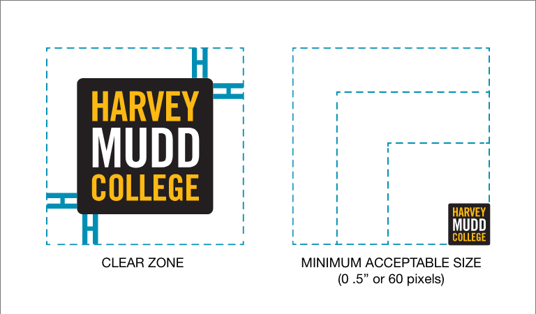
When the exception of logo mock-ups, a clear-zonem, defined by the distance of the capital “H” in the logo, should be maintained at all times.
The logo should be produced at a reasonable size to maintain legibility. For printed materials, the logo must never be reproduced smaller than one-half inch wide. For digital user, the logo must never be smaller than 60 pixels wide.
Logo minimum width of 1/2 inch.
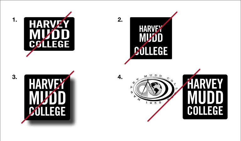
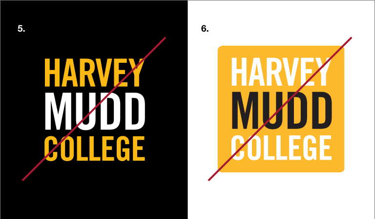
It is extremely important for consistency’s sake that the logo be displayed correctly and consistently. The following examples illustrate a few of the unacceptable used of the logo.
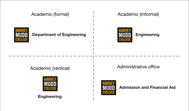
The typographic locksups, or arrangements, have been created for use by all academic and administrative units. Please don’t customize or otherwise rearrange these lockups. Use the horizontal version wherever possible. Use the vertical design when space is limited.
If you have questions, contact Robert Vidaure, art director (rvidaure@hmc.edu, 909.621.8478).